Introduction
IELTS line graph questions are an easy type of question to attempt. You need to interpret the data trends the lines represent over time.
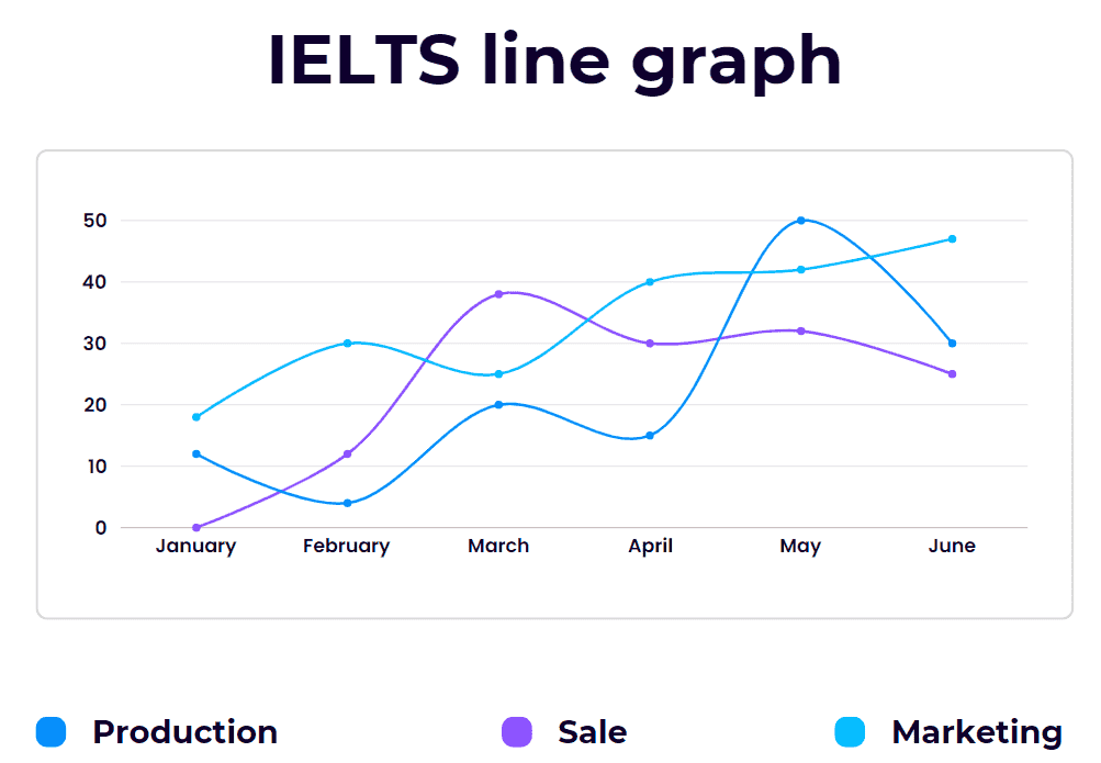
Solved Example
Source: Official IELTS website www.https://ielts.org
IELTS bar graph tips
Follow the essay structure
Follow the shared essay structure. Constant practice will make it easier to attempt the essay questions and reduce the time taken to try these.
Structure
Introduction – paragraph 1
Overview – paragraph 2
First main feature – paragraph 3
Second main feature – paragraph 4
Stick to the word limit
If the task says you have to write a minimum of 150 words, ensure you write at least 150 words, but keep it within 200 words
IELTS line graph strategy
Observe the data types on the axes
Observe the data types given on the X and Y axis of the bar graph.
The X-axis is the graph’s horizontal axis and the Y-axis is the vertical axis.
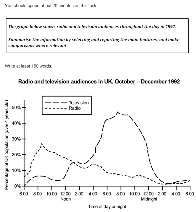
In the example above, you will see that the X-axis displays the time of day or night and the Y-axis shows the percentage of the UK population over 4 years old.
Analyze the Legend
Analyze the legend if any given with the graph. The legend is the key that helps to understand what data is represented on the graph. In the example above the big sectioned line represents television and the small sectioned, line represents radio.
Check the heading and labels
Check the headings and labels for any information about the graph. In the example above the heading says radio and television audiences in UK, October to December 1992.
Look for trends
Look for trends in the data plotted in the graph.
Compare the data
Compare the data in the graph this will enable you to identify if there is an increase or decrease compared to other data points or over a period of time.
Essay structure for IELTS line graph
When writing the essay, follow the structure given below. It can be used as a template to plan your essay quickly.
Introduction – paragraph 1
Overview – paragraph 2
First main feature – paragraph 3
Second main feature – paragraph 4
Introduction – paragraph 1
The first part of the essay is the introduction to the essay. The introduction can be created by simply paraphrasing the question. Read the question and change it by using synonyms. You can also change the sentence structure but don’t copy and paste the exact sentence from the question.
Question: The graph below shows radio and television audiences throughout the day in 1992.
Introduction: The line graph displays the percentage of the UK population that watched TV and listened to the radio for over 24 hours from October to December 1992.
Overview – paragraph2
The second part of the essay is the overview. When writing the overview summarize the main points of the main features of the graph and make comparisons in the data.
Main feature 1 8 PM is the peak time when 50 percent of UK population watches TV.
Main feature 2 8 AM is the peak time when About 30 percent of UK population listens to the radio.
Once you have identified the main features convert them into sentences.
About 50 % of the UK population watches TV at 8 PM, whereas about 30 % of the UK population listens to the radio at about 8 AM. Overall more people watch TV in comparison to listening to the radio.
First main feature – paragraph 3
The TV viewership remains under 10 % from 6 AM to 12 PM, after that, it continues to rise sharply till 8 PM where it reaches its peak at 50 %. From 8 PM onwards it drops sharply till 1 AM and drops to about 1 %.
Second main feature – paragraph 4
The radio audience increases very sharply from 6 AM to 8 AM and reaches its peak of about 30%, after which it declines steadily to 2%, fluctuating at 4 PM and 10:30 PM after which it continues to drop. By comparing both graphs it is evident that most audiences like to listen to the radio in the morning while most enjoy watching TV at night.
Writing tasks require a lot of constant practice to master identifying the main points, planning, and ultimately writing the essay.
Complete Essay
The line graph displays the percentage of the UK population that watched TV and listened to the radio for over 24 hours from October to December 1992.
About 50 % of the UK population watches TV at 8 PM, whereas about 30 % of the UK population listens to the radio at about 8 AM. Overall more people watch TV in comparison to listening to the radio.
The TV viewership remains under 10 % from 6 AM to 12 PM, after that, it continues to rise sharply till 8 PM where it reaches its peak at 50 %. From 8 PM onwards it drops sharply till 1 AM and drops to about 1 %. The radio audience increases very sharply from 6 AM to 8 AM and reaches its peak of about 30%, after which it declines steadily to 2%, fluctuating at 4 PM and 10:30 PM after which it continues to drop. By comparing both graphs it is evident that most audiences like to listen to the radio in the morning while most enjoy watching TV at night.
Word count – 175 words