Introduction
Ielts Table chart task 1 is easier than other essay writing tasks, especially the multiple graphs. In this task, you must analyse and identify the main points from a table. We call this easy because the data is structured into rows and columns and is easier to comprehend.
Solved Example
The table below shows the occupation by gender in a district
Summarise the information by selecting and reporting the main features, and make comparisons where relevant.
Write at least 150 words.
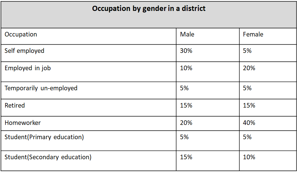
Table chart task 1 tips
Follow the essay structure
Follow the shared essay structure. Constant practice will make it easier to attempt the essay questions and reduce the time to try these.
Structure
Introduction – paragraph 1
Overview – paragraph 2
First main feature – paragraph 3
Second main feature – paragraph 4
Stick to the word limit
If the task says you have to write a minimum of 150 words, ensure you write at least 150 words, but keep it within 200 words
Table chart strategy
Read and understand the question
Example question
The table below shows the occupation by gender in a district
Summarise the information by selecting and reporting the main features, and make comparisons where relevant.
Write at least 150 words.
The question shows a table that displays the occupations categorised by gender in a district. You need to summarize the main features and draw comparisons in the data in the table. Write at least 150 words anything below the limit will negatively impact your marks.
Identify the main features
Identify the main features in the table. You need to look out for the features that stand out in the table, they could be the highest or the lowest values or a comparison of values between two or more items in the table. Check for the following to identify the main features
- Heading of the table
- Unit of measure used e.g. whether the values are in percentages, counts, etc.
- Time durations or periods like years or months.
- data trends or any changes in data over a period. Whether there is an increase or decrease.
Essay structure for IELTS multiple graphs
Structure
Introduction – paragraph 1
Overview – paragraph 2
First main feature – paragraph 3
Second main feature – paragraph 4
Introduction – paragraph 1
The first part of the essay is the introduction to the essay, which can be created by paraphrasing the question. Read the question and change it by using synonyms. You can also change the sentence structure but don’t copy and paste the exact sentence from the question.
Question: The table below shows the occupation by gender in a district.
Introduction: The Table displays the percentage of males and females employed in various occupations in a district.
Overview – paragraph2
In the overview, you should describe the main features of the table and draw any comparisons, avoid going into details at this stage. You can explain the details in the next two paragraphs.
Example: According to the table, 40% of females are homeworkers, while only 20% of males are homeworkers. This is half the percentage of females in this occupation type. 30% of males are self-employed, the highest percentage of males in a particular occupation category.
First main feature – paragraph 3
40% of females are homeworkers in the district.
The highest percentage of females in the given district are homeworkers at 40%. In comparison, the lowest percentage of females falls into three categories of occupations namely self-employed 5%, temporarily unemployed 5% and student (primary education) 5%. The second highest percentage of women are employed in a job, which is double the percentage of men in a job.
Second main feature – paragraph 4
30% of males in the district are self-employed.
The highest percentage of males in the district are self-employed at 30%. The lowest percentage of males 5% each are either temporarily unemployed or students in primary education. 15% of males and females are retired. 15% of males are students in secondary education whereas only 10% of females are in secondary education which is 5% less than their male counterparts.
Complete Essay
The Table displays the percentage of males and females employed in various occupations in a district.
According to the table, 40% of females are homeworkers, while only 20% of males are homeworkers. This is half the percentage of females in this occupation type. 30% of males are self-employed, the highest percentage of males in a particular occupation category.
The highest percentage of females in the given district are homeworkers at 40%. In comparison, the lowest percentage of females falls into three categories of occupations namely self-employed 5%, temporarily unemployed 5% and student (primary education) 5%. The second highest percentage of women are employed in a job, which is double the percentage of men in a job.
The highest percentage of males in the district are self-employed at 30%. The lowest percentage of males 5% each are either temporarily unemployed or students in primary education. 15% of males and females are retired. 15% of males are students in secondary education whereas only 10% of females are in secondary education which is 5% less than their male counterparts.
Word count – 177 words